Carlos Chavarría Makes a Visual Study of Financial Districts and the Businessmen Who Populate Them
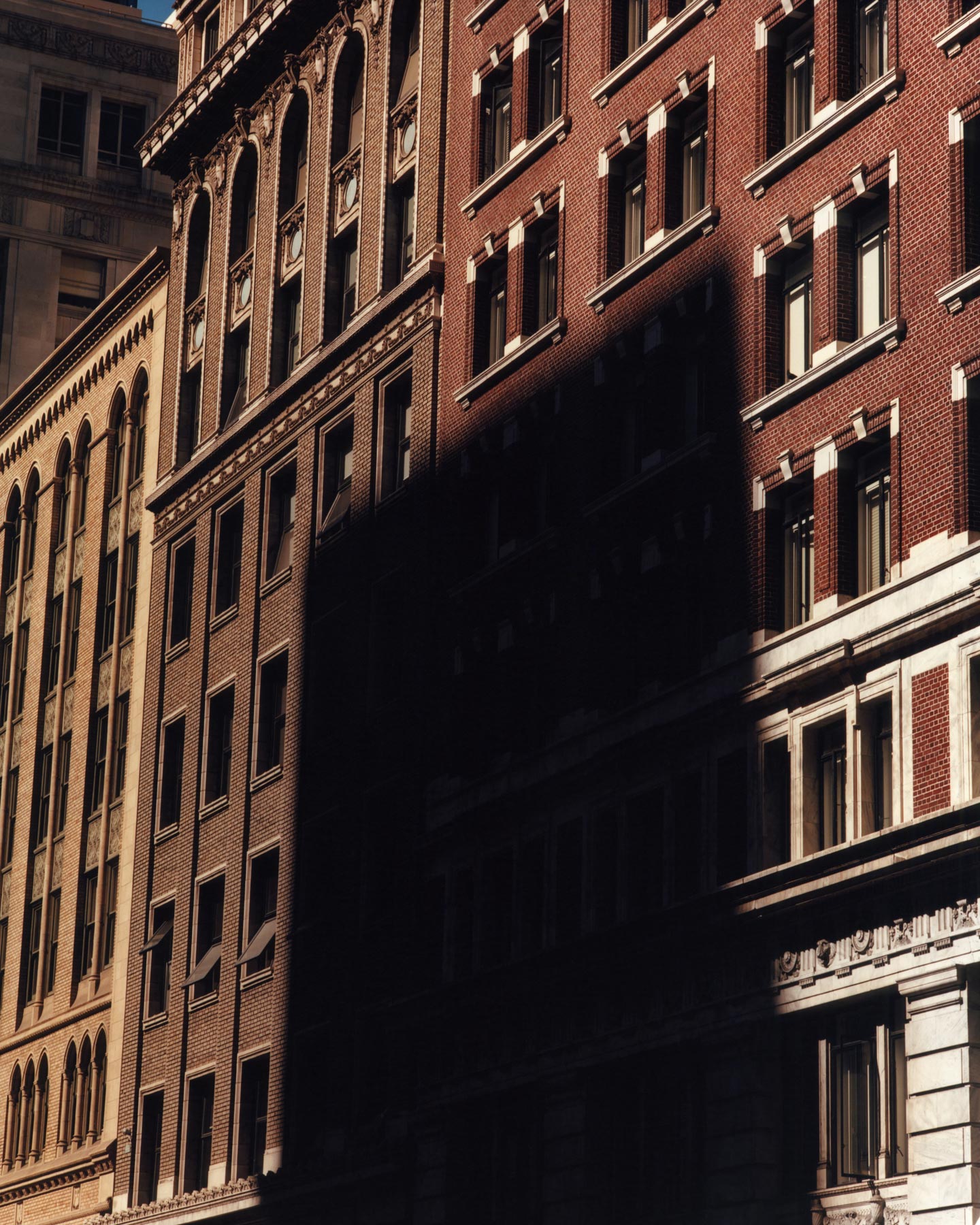
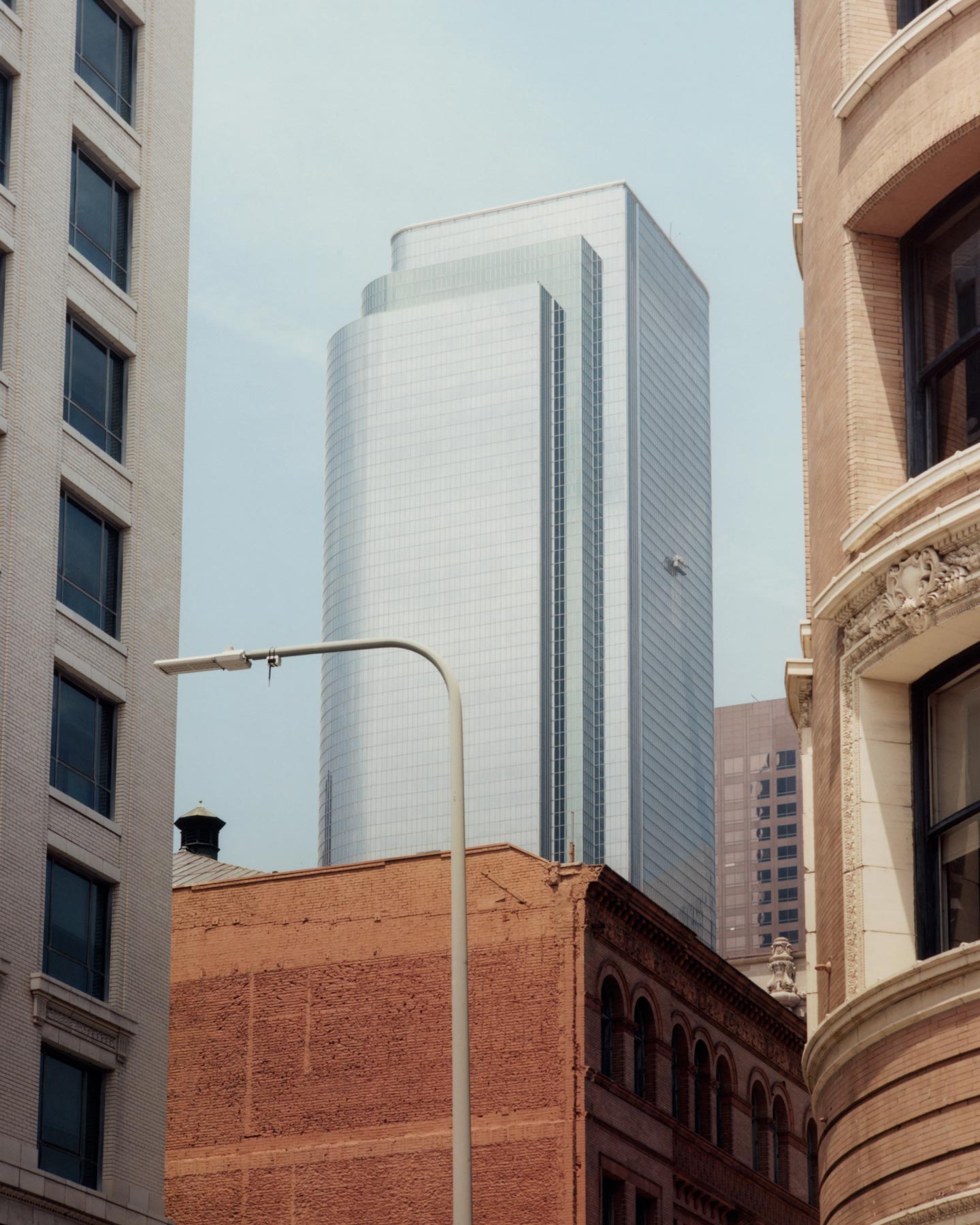
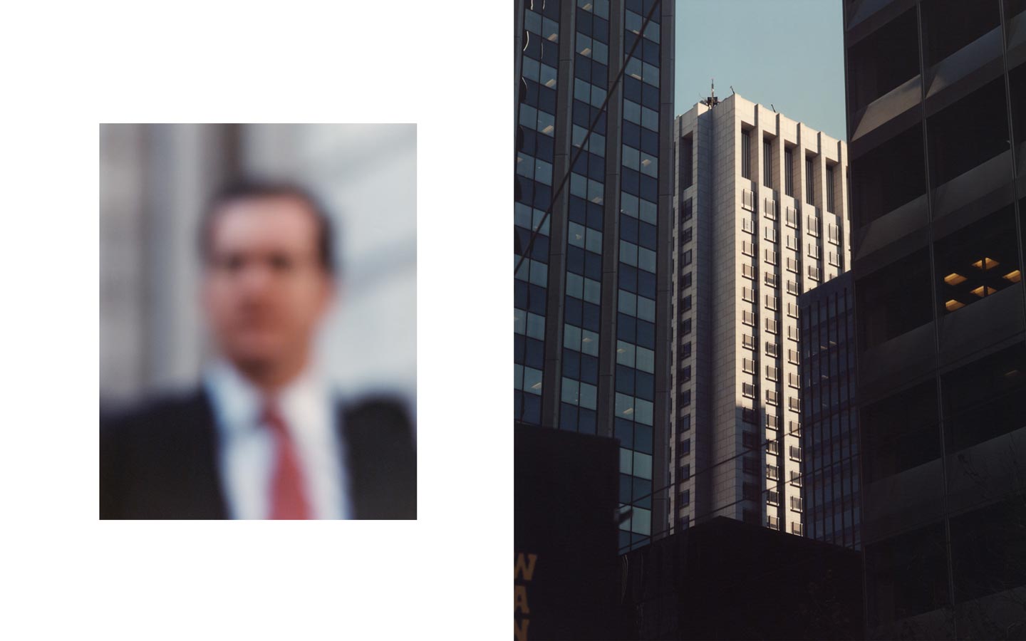
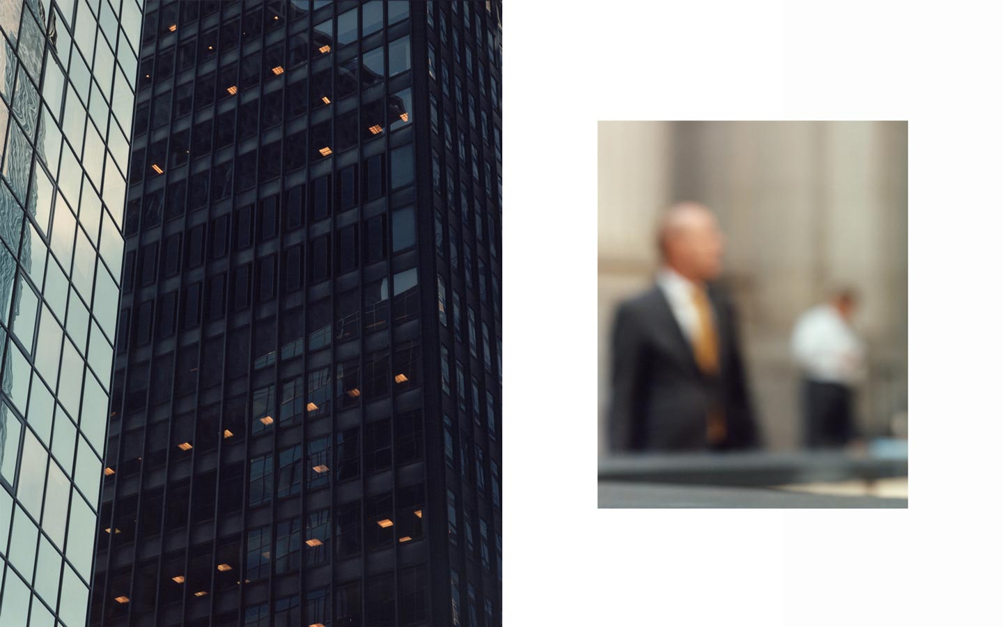
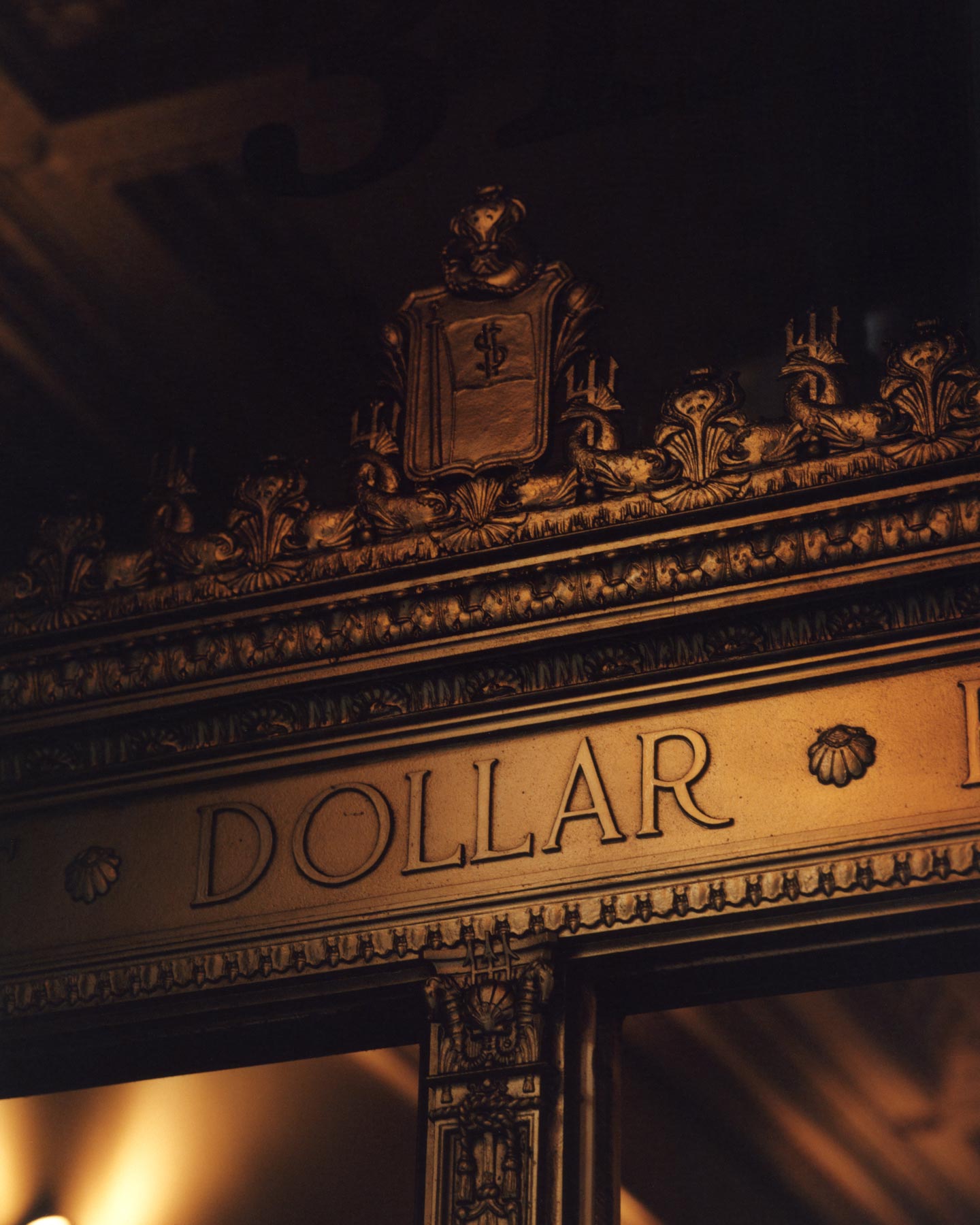
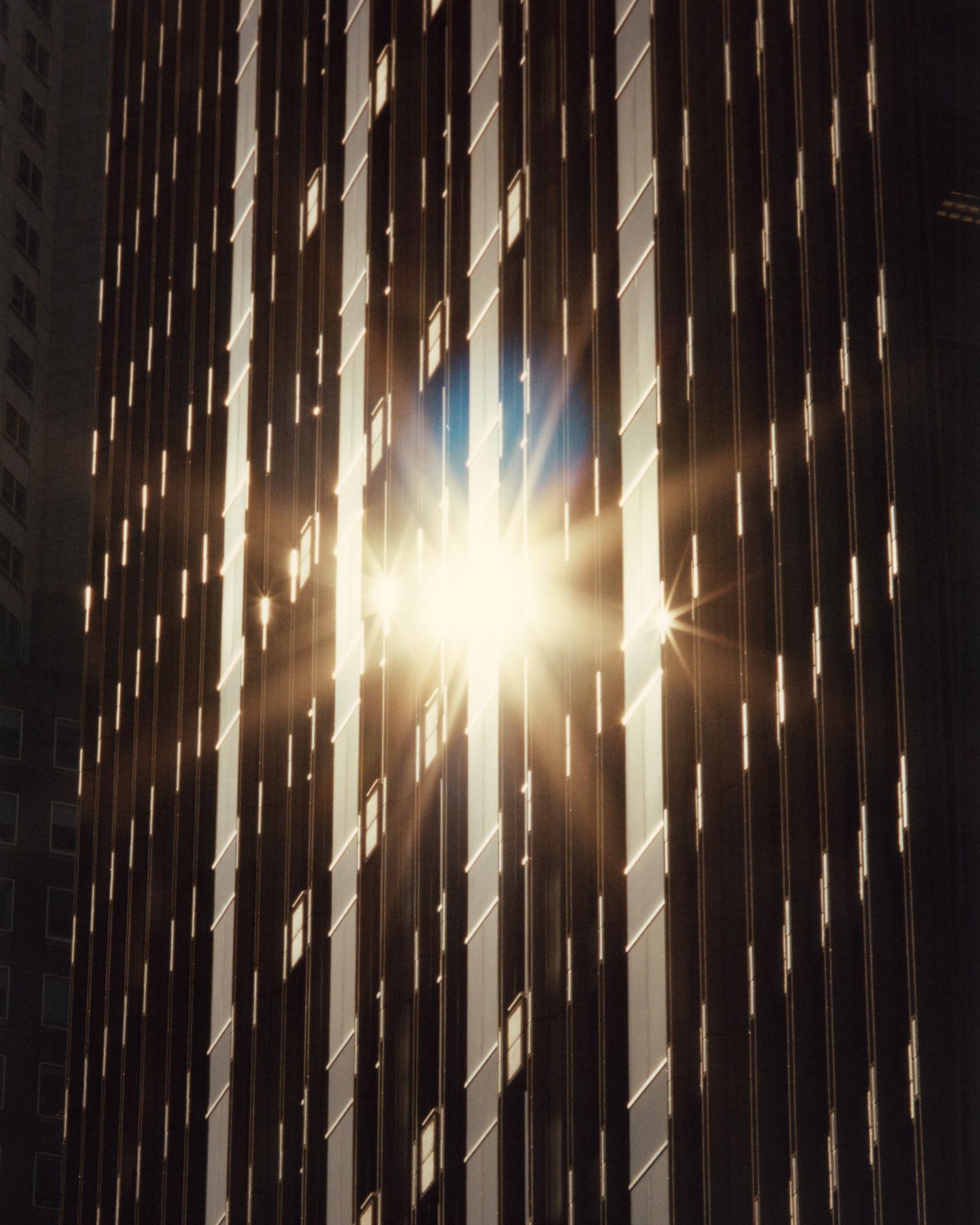
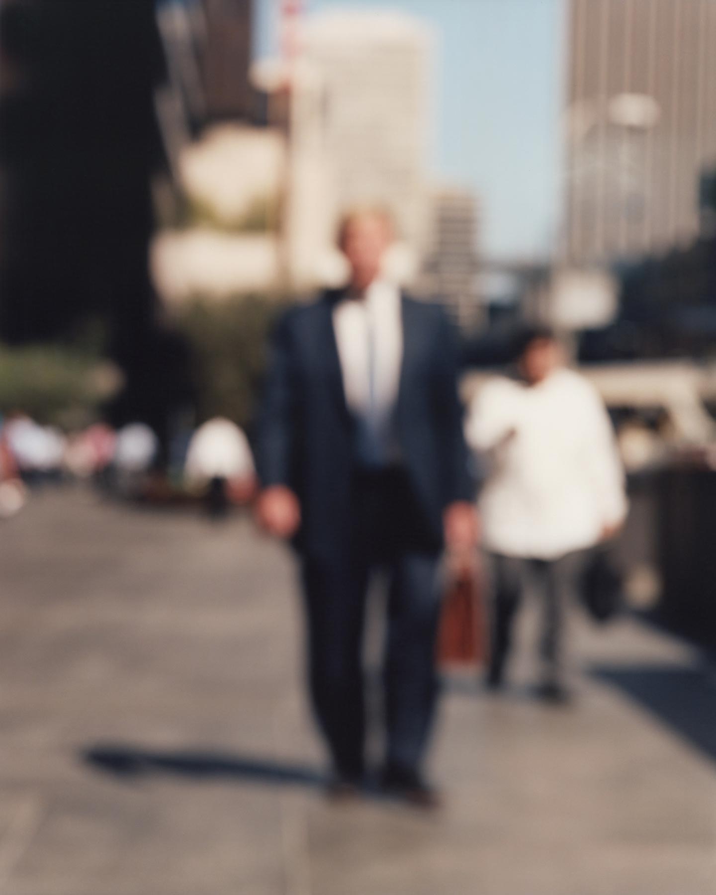
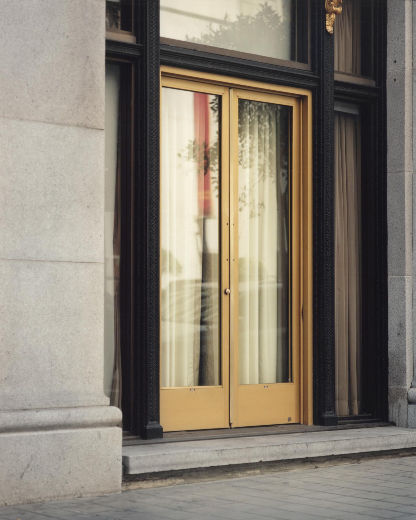
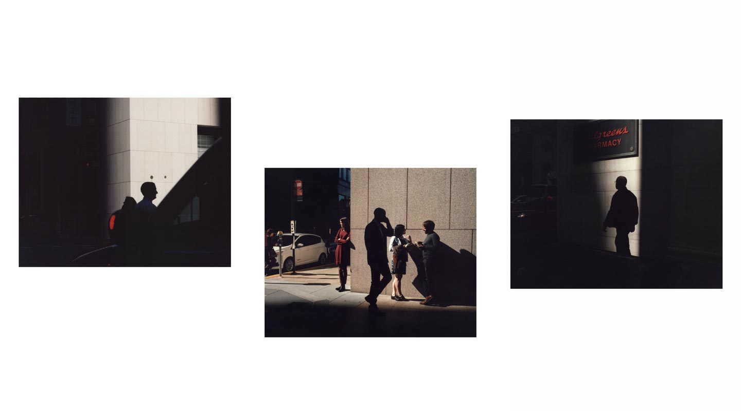
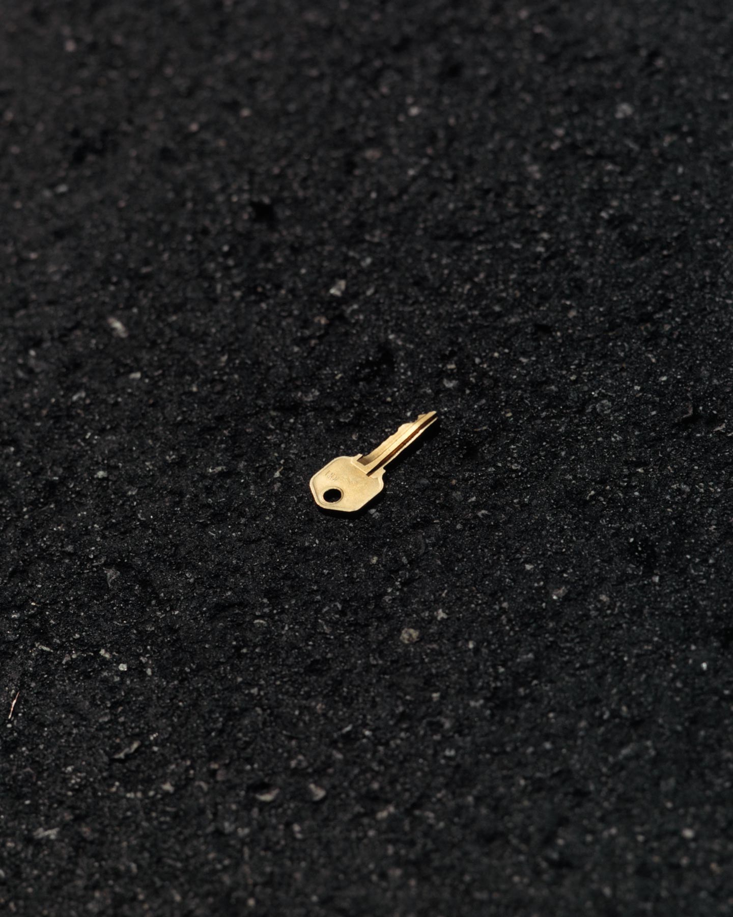
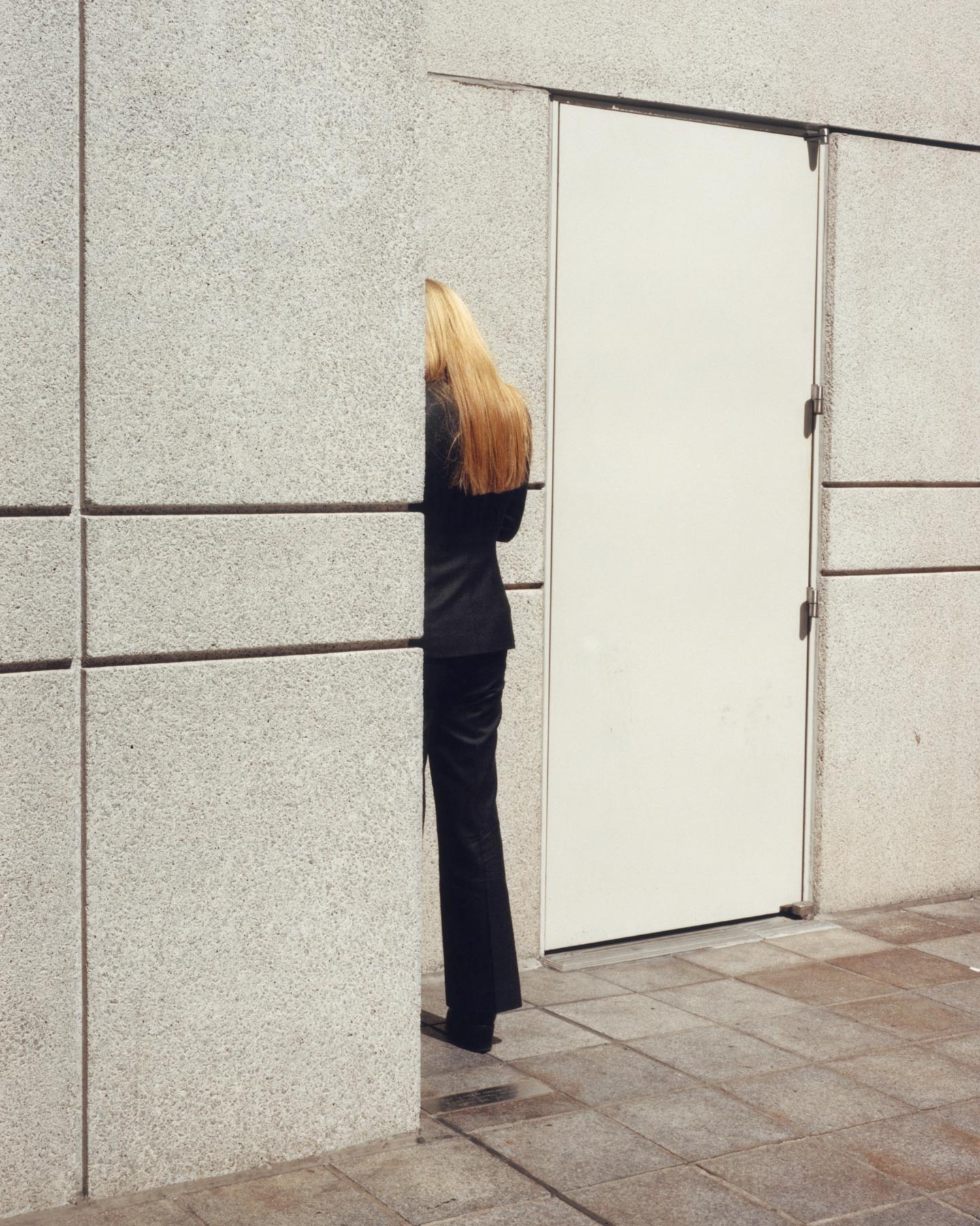
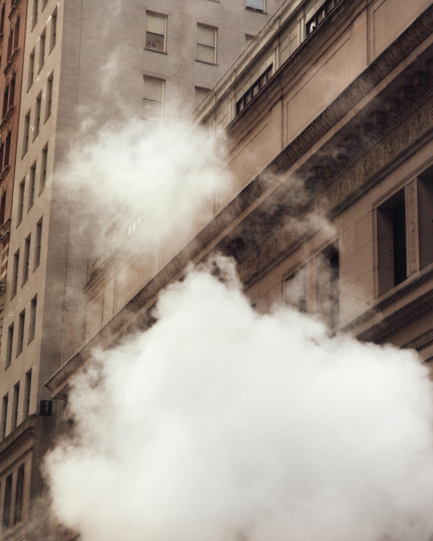
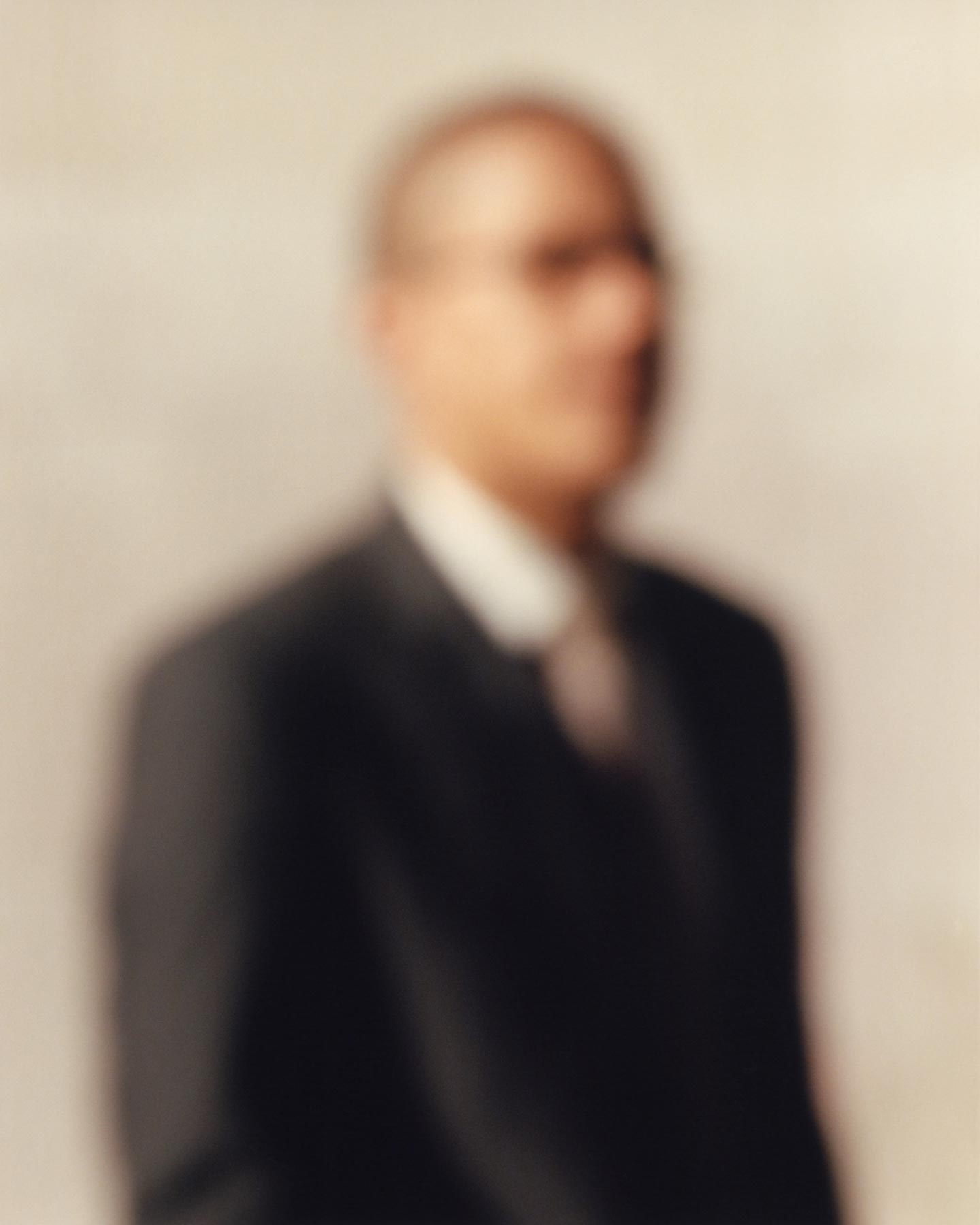
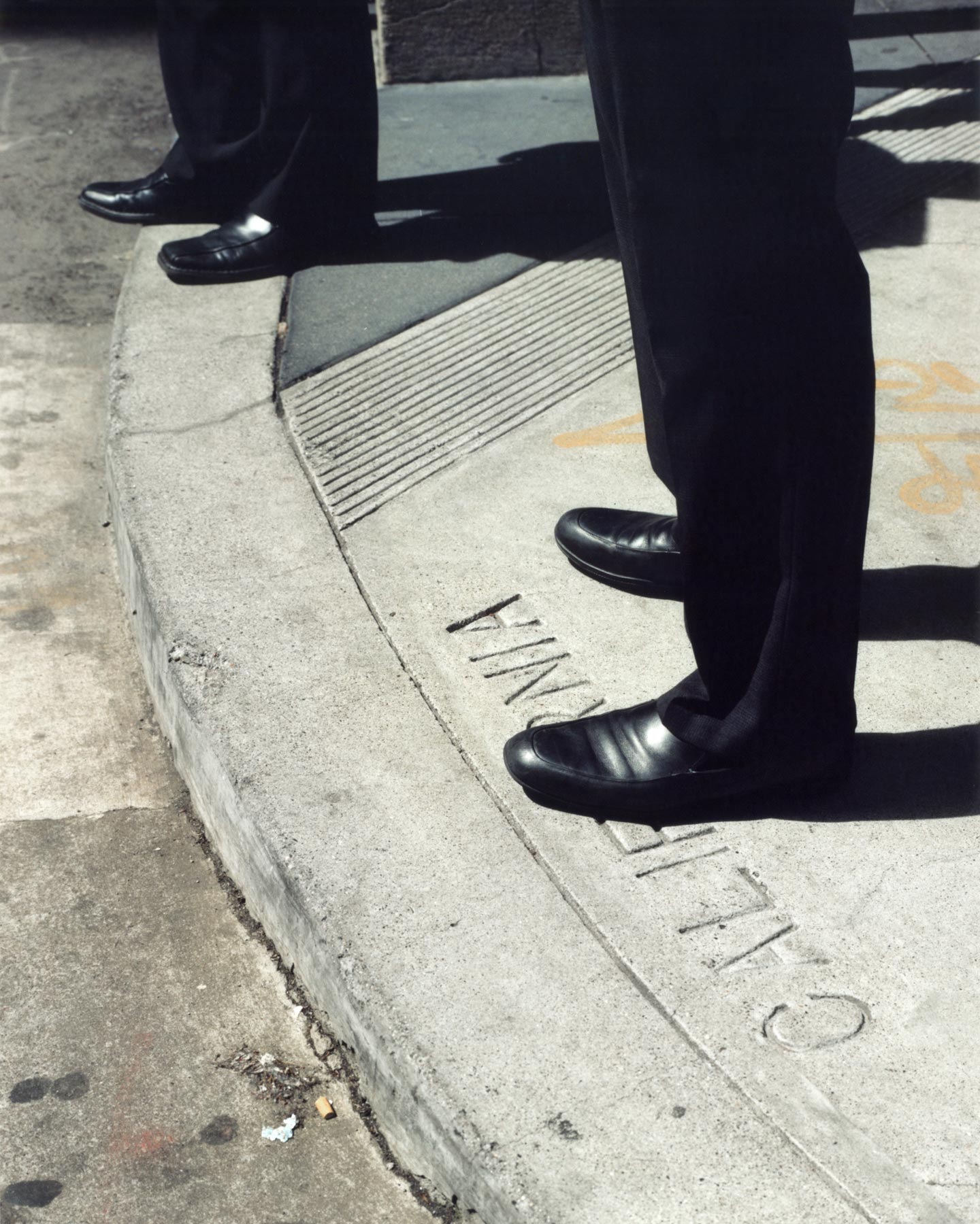
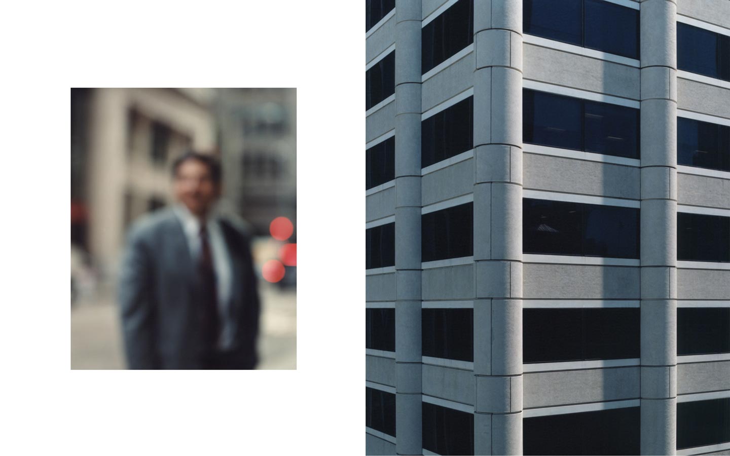
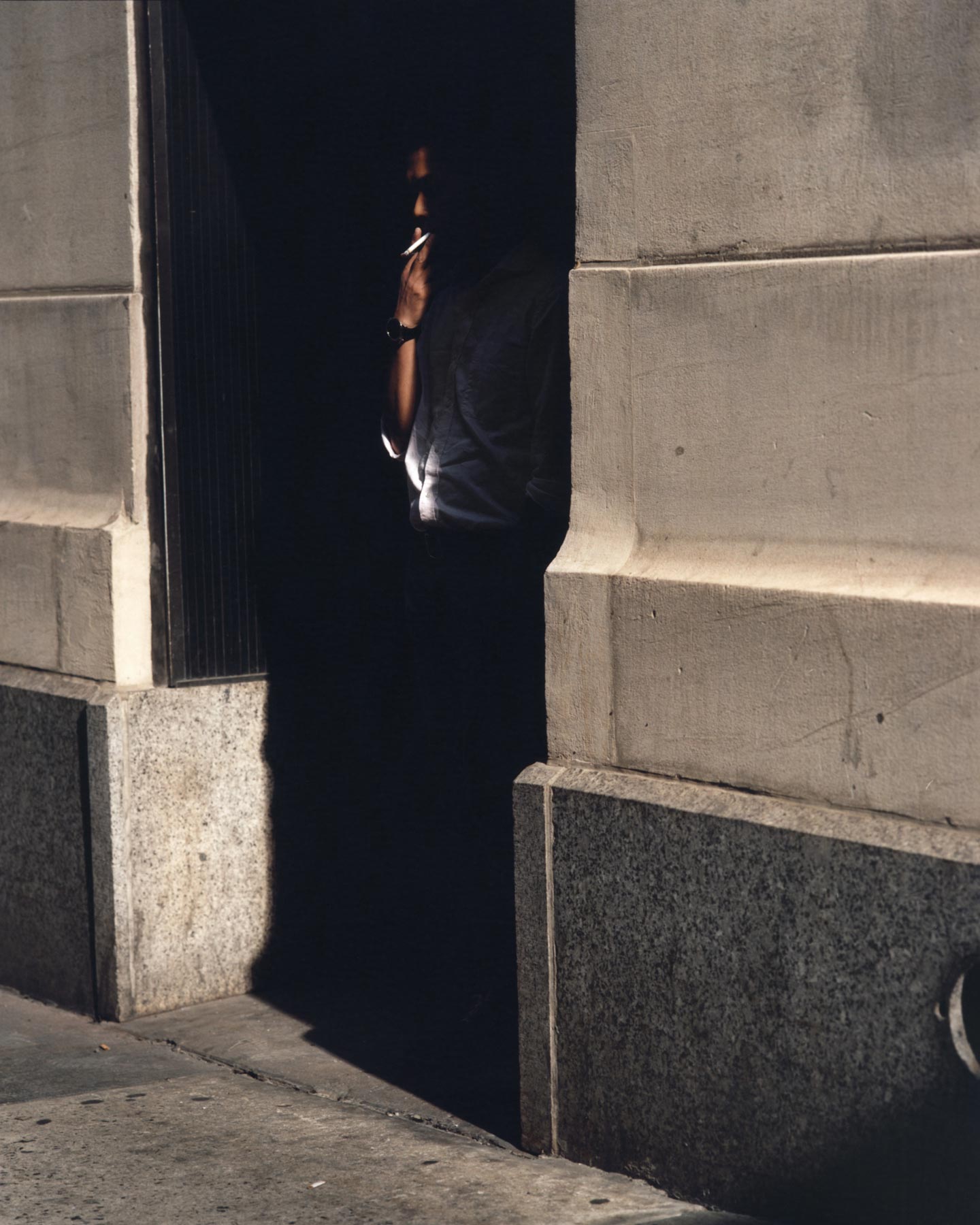
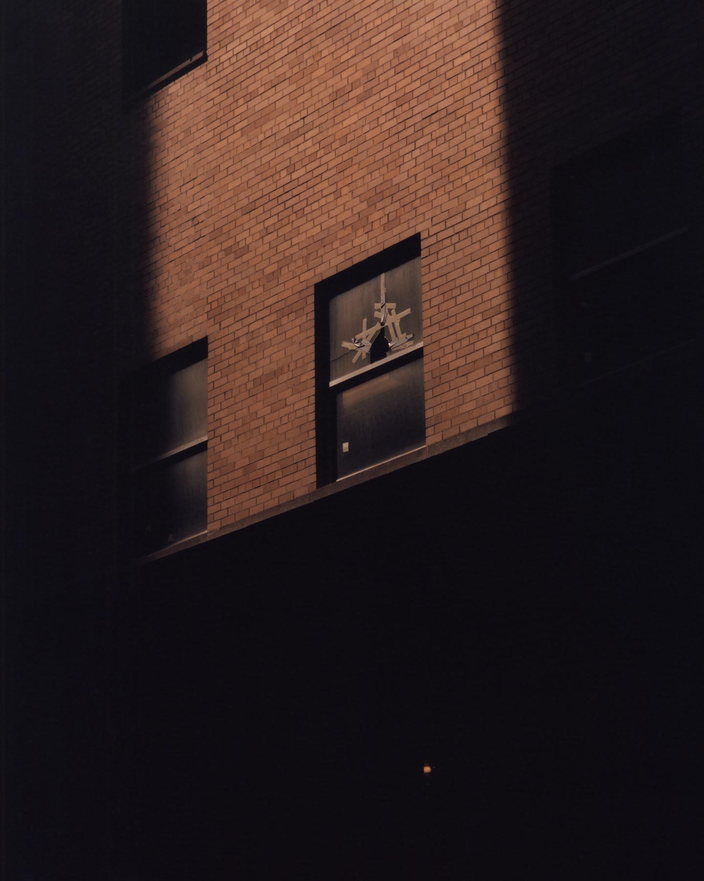
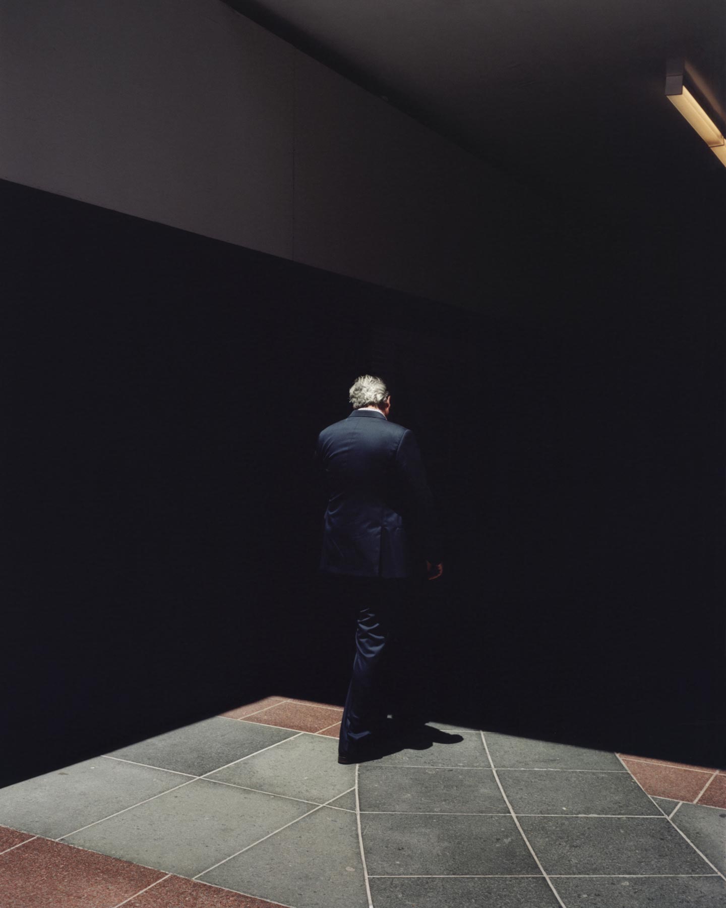
What defines financial districts in terms of visual qualities? What are a financial district’s distinctive physical traits in contrast to other types of urban environments? These seem to be the questions at the core of Façade, a new series by 32 year-old photographer Carlos Chavarría. Interestingly, Carlos treats the typical human component of financial districts—the businessmen and businesswomen—as if they were depersonalized (you can hardly see their faces; in fact, some images are intentionally blurred), which adds a slightly unsettling side to the project.
Hello Carlos, thank you for this interview. What are your main interests as a photographer?
I don’t think I have a short answer for that but I’d say I’m mainly interested in the endless possibilities that photography offers as a language, and its ability to transmit certain things that other mediums are unable to.
Please introduce us to Façade.
Façade is an ongoing project that I started in 2014 and the result of the work I’ve been shooting in the financial district areas of different U.S. cities.
What inspired Façade? How did you get the idea of making a project about the business world?
I always have been fascinated by the busy streets of big cities as they are one of the places I feel most comfortable shooting in: the rapid-changing light, the sun bouncing off the skyscrapers, the alleyways, the crowds, etc. create a very special atmosphere that makes them one of the most exciting places for me to photograph. In 2013, while looking for old photographs at an antique shop here in San Francisco, I came across a group of images of different business meetings and conferences—they were beautiful 8×10 black and white prints, most of them group shots showing men in suits shaking hands, posing together and smiling… I was instantly blown away by the images, there was just something about them that I found so compelling, they looked so perfect and fake at the same time. The people in the photographs looked so similar to each other, almost like clones, all of them wearing the same outfits, posing with the same forced smiles and body language. Everything had an artificial quality to it that I thought was amazing; with those images I actually made a small project called The Sketchbook #2, which turned out to be the seed of what later became Façade.
After completing The Sketchbook, the photos remained stuck in my head and made me start thinking about photography and the classic image of power and success in the business world—how these ideas are so strongly connected with appearances and superficiality, and how that could also be found and perceived at a visual level in the financial districts. In order to continue exploring the subject I decided to start spending some time photographing there. I didn’t know what the project was going to be like or even if there was going to be a project at all at the time; but I felt like these places, in a way, embodied all those things that I had found fascinating in the old black and white photographs.
What was your main intent in creating this series?
Like with every project, I think it all starts out of curiosity, and the main intent is always trying to find answers and understand what draws you towards that subject, to ultimately translate it into images.
Can you talk a bit about your creative process for Façade? How do the images reflect your ideas behind the project?
In the beginning I guess I was just trying to create a relation with these places, and in order to do that I would go over and over to the same spots to photograph and get familiar with the space, the light, etc. At the same time, I was trying to think how I could create groups of images that would reflect what I was looking for but that could also interact with each other to create a rhythm in the series. I think it’s a mix of intuition and a trail-and-error process until you feel you’ve found the right path for the project.
For the pictures of people for instance: after trying different things I decided that I wanted to move away from the classic street photography approach that is more aggressive and shows individuals looking straight to the camera with an angry expression. I started using different ways to avoid showing any faces in the pictures, sometimes by shooting out of focus, from behind the subjects, using shadows, etc. but it wasn’t until I started the editing process that one of the pivotal moments of the project happened. Taking a look at what I had shot, I put together one image of a building façade along with an out-of-focus portrait of a person in a suit, and something just clicked: the contrast between the subtle lines of the perfectly recognizable suit and tie in the blurry image in opposition to the sharp details of the building just worked great. On one hand the out-of-focus images eliminated any trace of personal identity of the subjects, almost transferring it to the buildings’ façades, embracing the idea of anonymity and confronting both elements at an equal level; on the other hand I felt like those pictures together and at a certain size created some kind of special tension between them that set the mood that I wanted for the whole series, so I discarded other ideas and went back to keep shooting in that direction.
Did you have any specific references or sources of inspiration in mind while working on Façade?
Apart from the found imagery I mentioned before, many photographic references came to mind like Paul Strand’s iconic picture Wall Street, Lars Tunbjörk’s series Office or the beautiful book Of New York… by André Kertész that a friend of mine recommended while I was working on the project.
How do you hope viewers react to Façade, ideally?
I really don’t know. Hopefully the images will mean something to them, perhaps something completely different to what my intention was. That would be wonderful too as I think that’s also the beauty of photography.
What have been the main influences on your photography?
I guess my personal experiences, the people around me, the places I’ve been and the things I’ve seen.
Who are some of your favorite contemporary photographers?
There are so many. Joel Sternfeld is always been one of my favorites; also Philip-Lorca diCorcia, Larry Sultan, Paul Graham, Sophie Calle, Lars Tunbjörk and many more.
What’s the last photobook you bought?
The Stage by Donigan Cumming.
Choose your #threewordsforphotography.
We. Hate. Photography.
Keep looking...
FotoCal — Photography Awards, Grants and Open Calls Closing in June 2023
FotoCal — Photography Awards, Grants and Open Calls Closing in May 2023

FotoCal — Photography Awards, Grants and Open Calls Closing in April 2023
FotoCal — Photography Awards, Grants and Open Calls Closing in March 2023
FotoCal — Photography Awards, Grants and Open Calls Closing in February 2023
FotoCal — Photography Awards, Grants and Open Calls Closing in January 2023
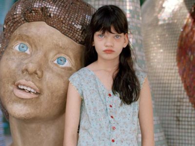
Discover the “Sweet and a Little Bit Sad” Photography of Annie Collinge
