Notes On a Place — Kimmo Metsäranta Photographs Helsinki’s Non-Monuments
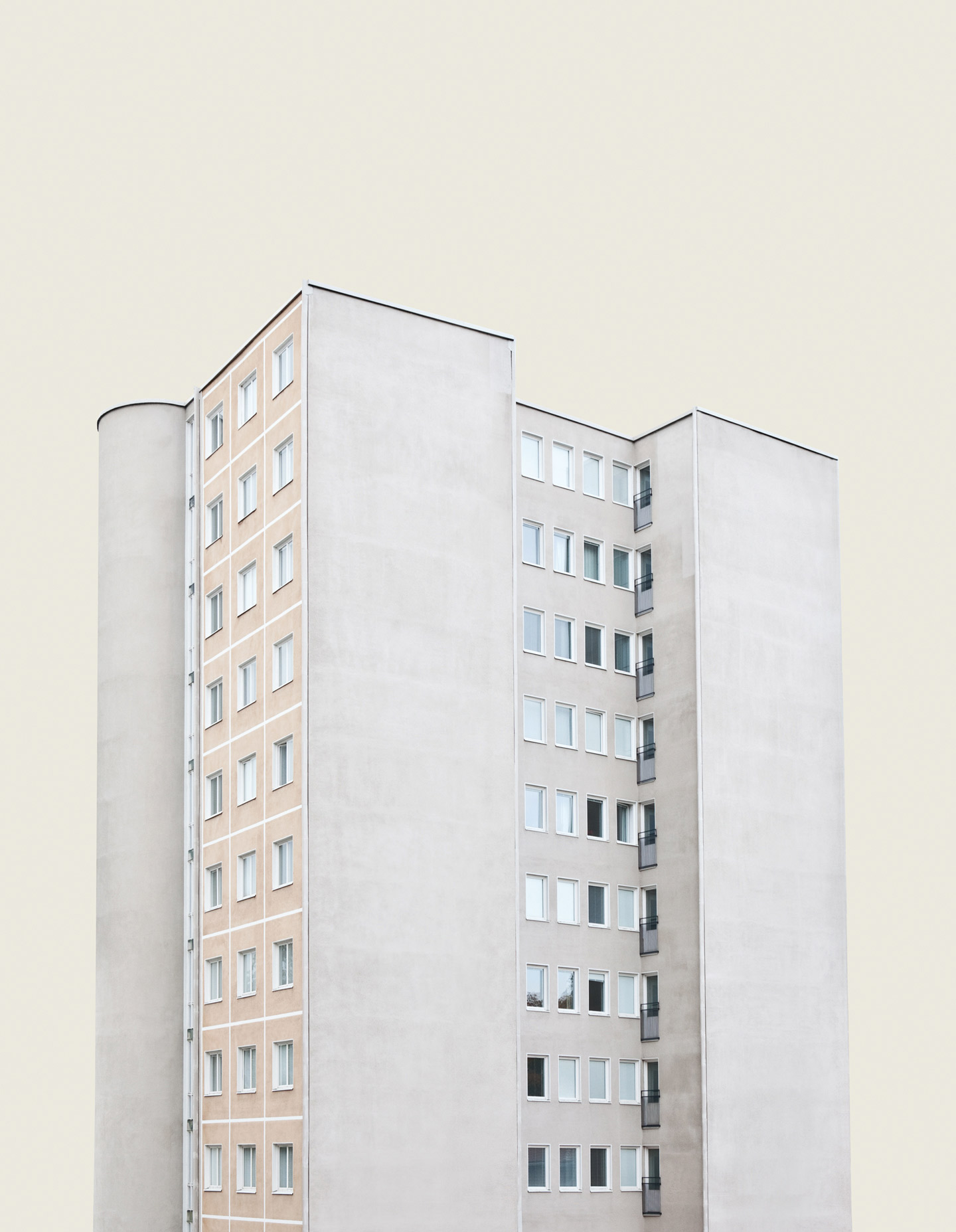
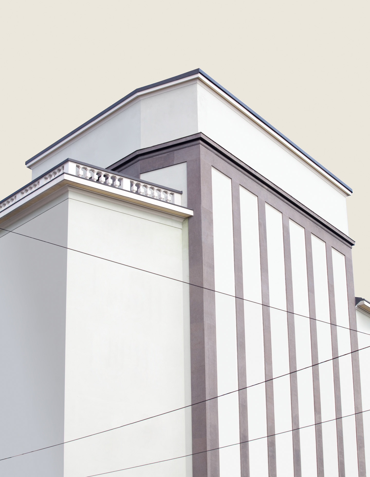
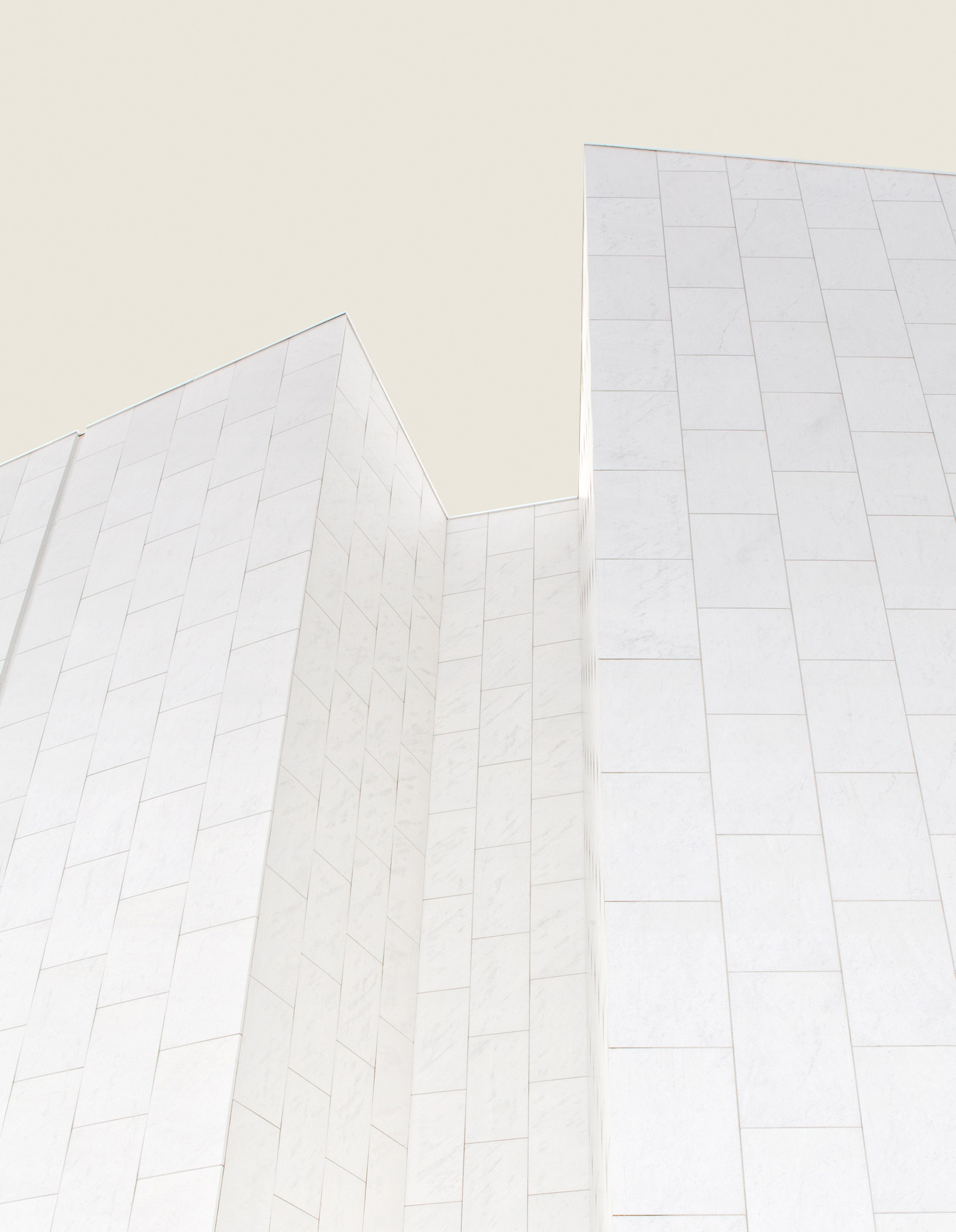
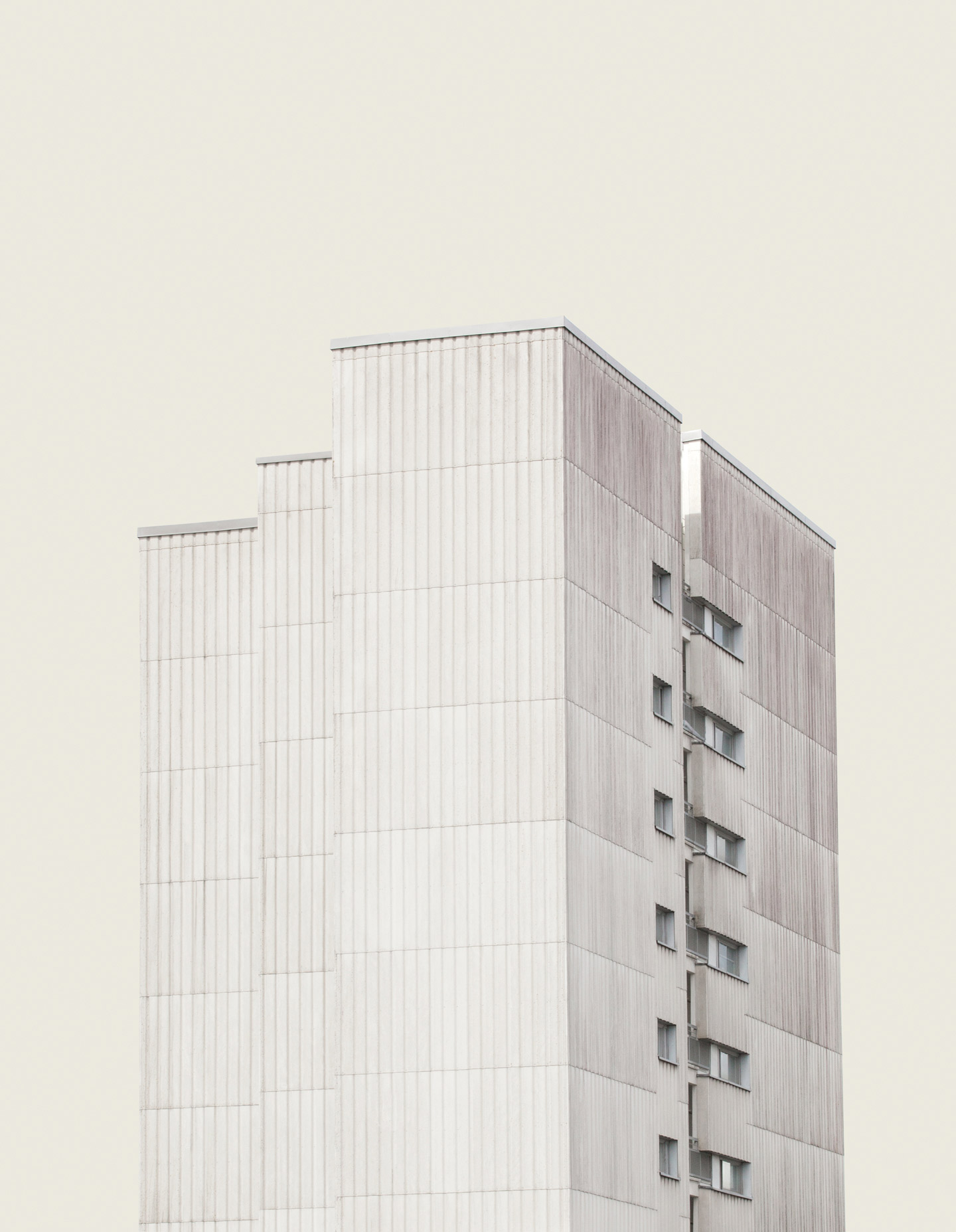
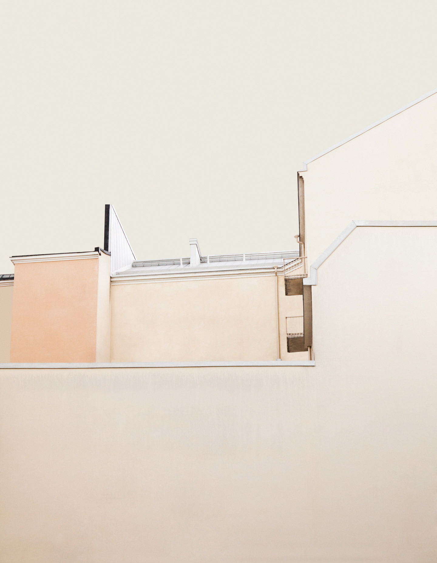
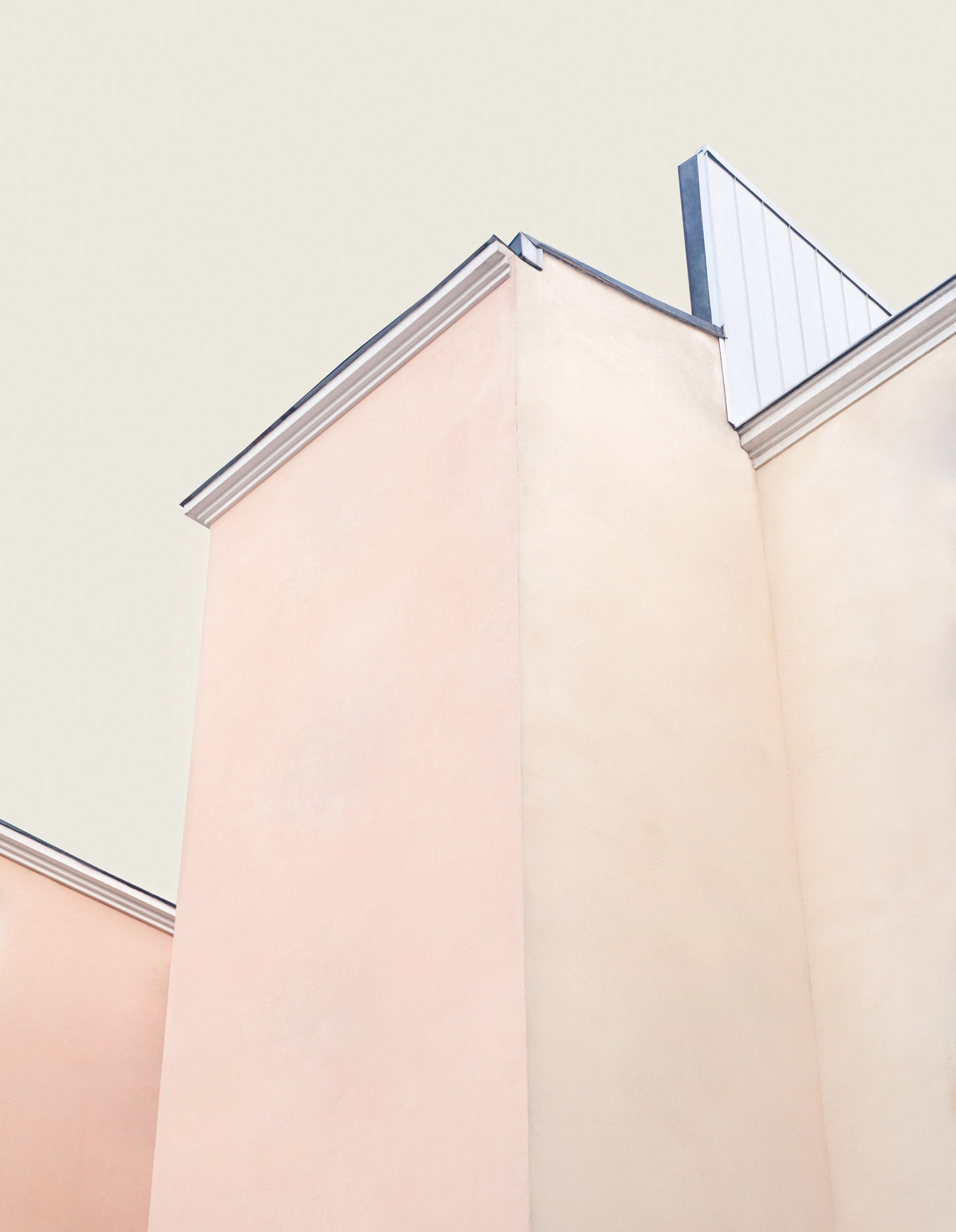
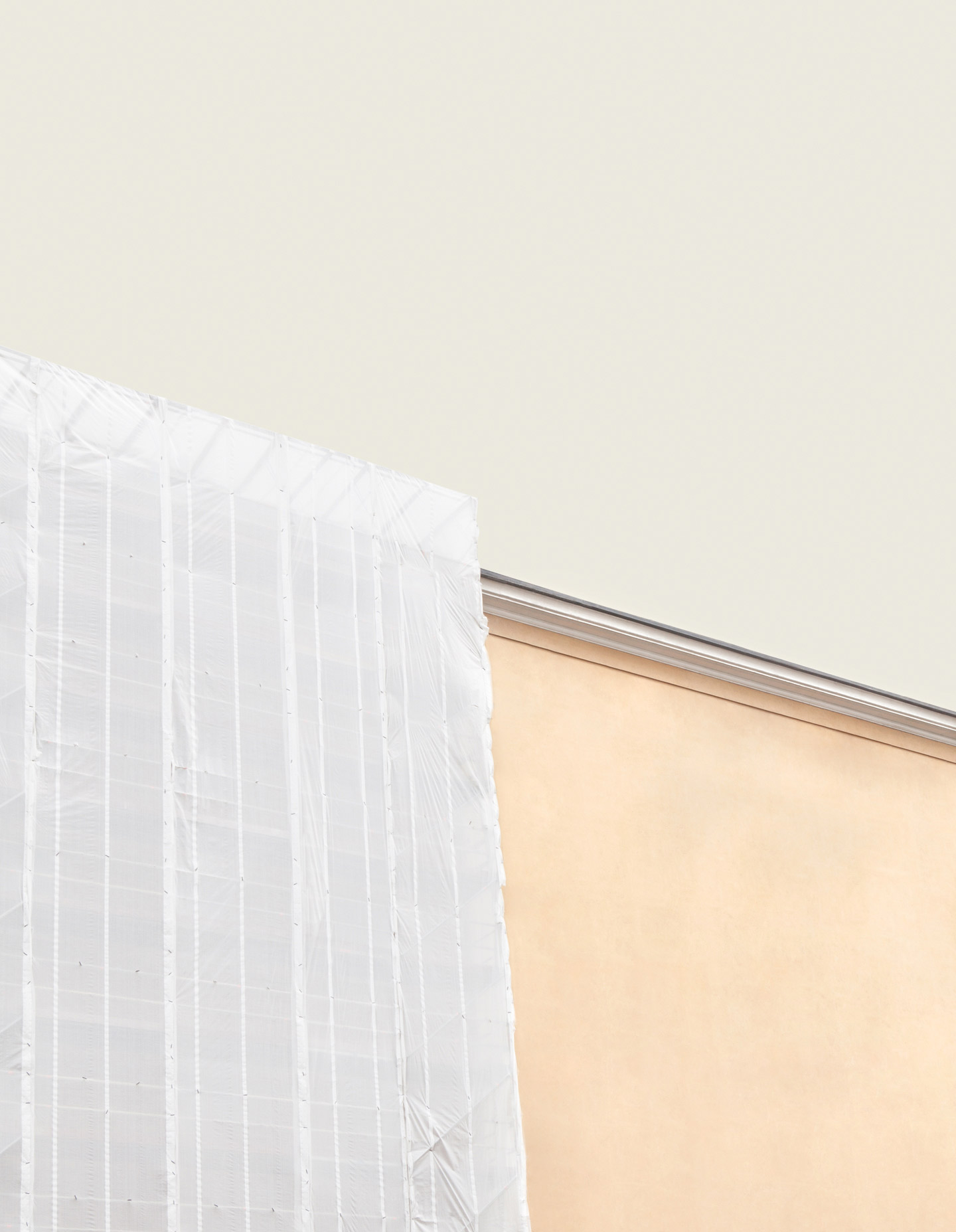
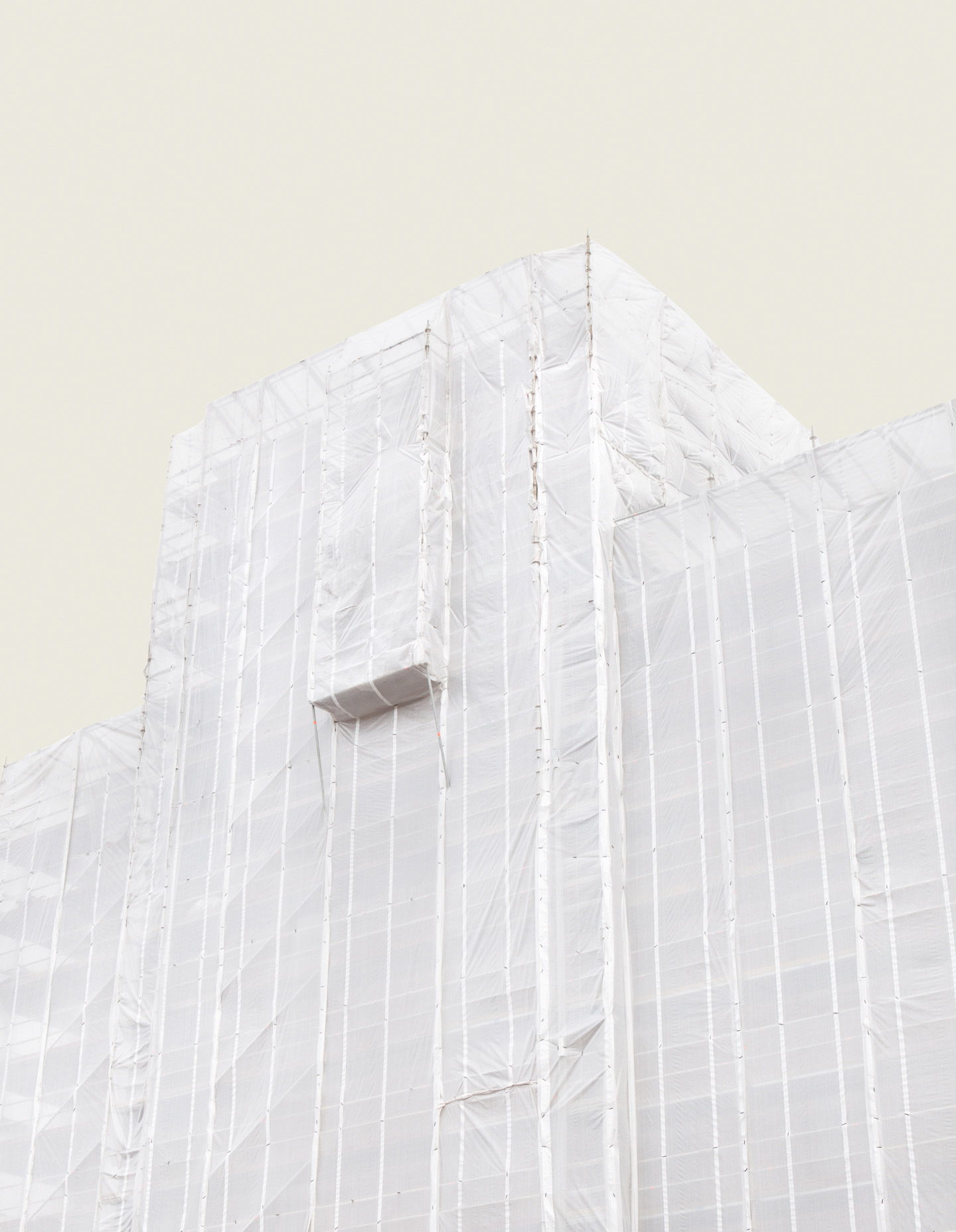
37 year-old Finnish photographer Kimmo Metsäranta outlines his series Notes on a Place, a set of digitally manipulated photographs in which ordinary, anonymous buildings of Helsinki are for once treated as if they were main tourist attractions.
Hello Kimmo, thank you for this quick Q&A. What are your main interests as a photographer?
I am fascinated with the everyday and the mundane, the relations between people and places and the ways we interpret our daily surroundings. I aim to look at things from multiple angles and question why they present themselves as they do – I guess I want to make things clear for myself.
What is Notes on a Place about in particular, and what was your main intent behind the work?
Most of our mundane views consist of anonymous structures, in-between places that we pay little or no attention to. In today’s hectic world there is little time to be truly present in the moment; to observe the’obvious’ around you. We have preset destinations and attractions for leisure experiences; we make extra efforts to go to certain must-see places. There is a sort of general consensus of what is worth seeing. Especially in photography, you tend to see the same images over and over. With Notes on a Place I wanted to bring to the forefront the ignored and dismissed places we pass by daily, and turn them into attractions.
How did you get the idea for Notes on a Place?
There are some popular attractions for tourists near my workplace, and people are always asking for directions to one or the other. It seems like there’s nothing to see beside those sights. At some point I wondered why this is the case, and I felt I might have been missing a lot of what was around me. It’s easy to just take things for granted. I wanted to get a new perspective on my everyday experience and question how we position ourselves in relation to our immediate surroundings. During the process, the feeling of being present became more important than taking the pictures. It took quite a bit of time before I figured out how to visualize these ideas.
Based on what did you pick the buildings that you used in the Notes on a Place images? And is there any precise reason why you chose a yellow-gray as the background color?
The majority of the places you see in the images are from my everyday route from home to work. They are buildings I had never really noticed before – in fact, after I started working on Notes on a Place I began seeing these almost monument-like structures all around me; sights left unseen. I also had to keep into account some technical aspects when choosing the buildings. They had to be clearly visible because I wanted to detach them from their surroundings.
Adding a background color was a conscious choice right from the beginning. I wanted to keep the color palette very narrow in order to distance the images from traditional landscape and architectural photography, and to have a more abstract approach. For continuity reasons the background color is the same in every image.
Did you have any specific reference or source(s) of inspiration in mind while working on Notes on a Place?
A book by French author Georges Perec titled An Attempt at Exhausting a Place in Paris was something I often had with me during the making of the series. In the book, Perec meticulously describes everything he saw while spending three days in a certain place in Paris. He wanted to see what happens when nothing happens. I did the same exercise myself near one of the places I later photographed. It was surprising to see how much happens around us all the time, absurd movie-like events; behaviors and incidents that we miss because we’re so caught up with ourselves.
What have been the main influences on your photography?
I like all kinds of imagery from a variety of different fields. More than photography I look at films, graphic design and installations. Lately I’ve been intrigued by still life photographs that incorporate people in one way or another.
Who are some of your favorite contemporary photographers?
I really like the work by Australian photographer Bill Henson – there is this huge tension in his work. Others would be Fleur van Dodewaard and Dominic Tarabanski.
Choose your #threewordsforphotography.
Structure. Interpretation. Movement.
Keep looking...

FotoCal — Photography Awards, Grants and Open Calls Closing in July 2025

FotoCal — Photography Awards, Grants and Open Calls Closing in June 2025

FotoCal — Photography Awards, Grants and Open Calls Closing in May 2025

FotoCal — Photography Awards, Grants and Open Calls Closing in April 2025

FotoCal — Photography Awards, Grants and Open Calls Closing in March 2025

FotoCal — Photography Awards, Grants and Open Calls Closing in February 2025

FotoCal — Photography Awards, Grants and Open Calls Closing in January 2025

